
STORYTELLING THROUGH VISUALIZATIONS
Sourcing Data My final project and very first interactive data story will be about the long term survival of the human race. I will be advocating space colonization. My data story includes historical information regarding population growth. Human expansion and travel. It will also include the current challenges of human environmental damage. On two occasions, theoretical physicist and cosmologist Stephen Hawking has argued for space colonization as a means of saving humanity. In 2001, Hawking predicted that the human race would become extinct within the next thousand years, unless colonies could be established in space. In 2006, he stated that humanity faces two options: either we colonize space within the next two hundred years and build residential units on other planets, or we will face the prospect of long-term extinction.
My first challenge for this project was obtaining reliable, sourced data. After some time browsing sources of historical and environmental trends, I can across a beautiful site called “Our World In Data”. https://ourworldindata.org/ This truly remarkable website provided all the information for the current planetary challenges and provided references and sources in excel format. After some cleaning and calculations, it was perfect for Tableau.
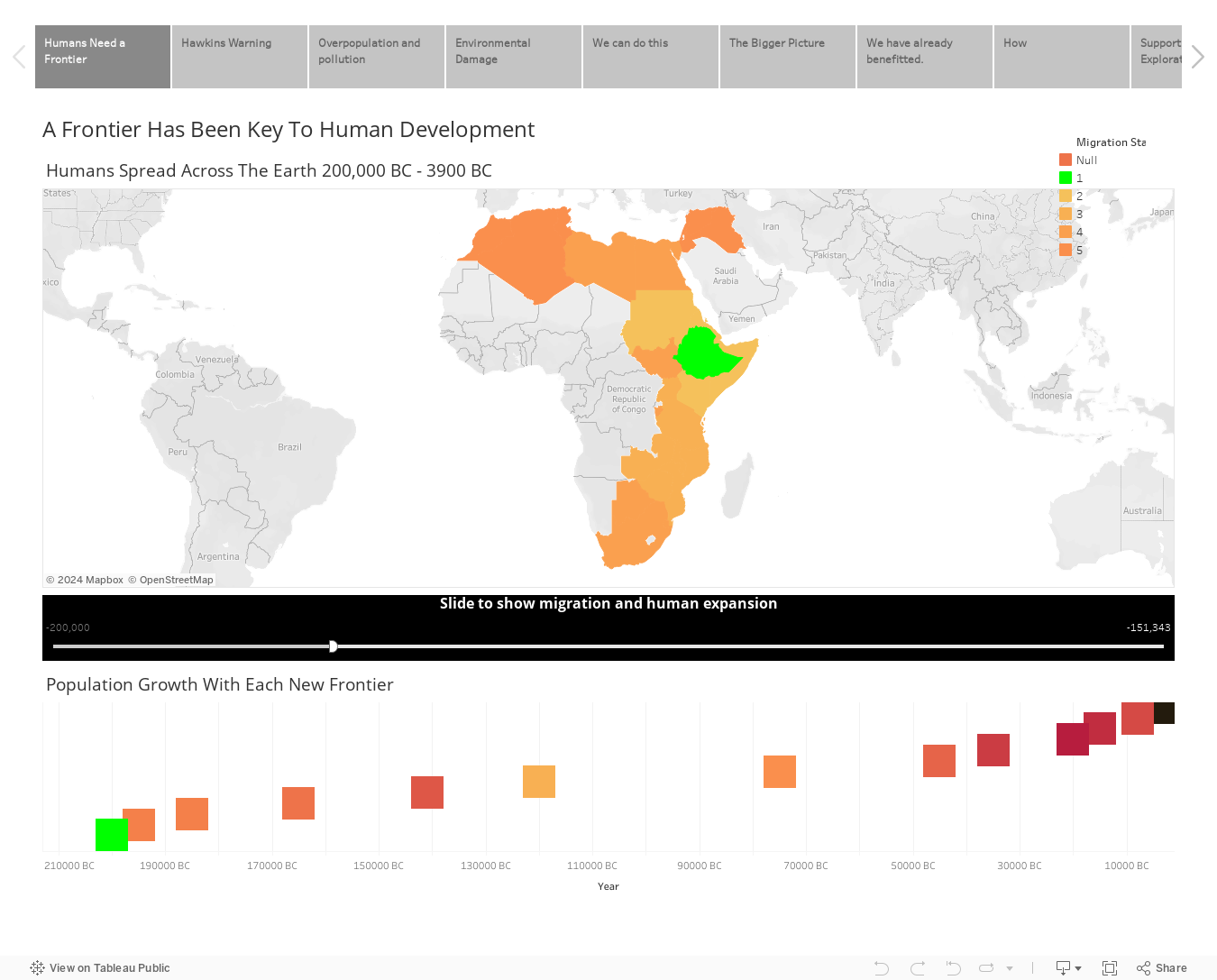
For the historical geographic data of human expansion, there is no source more reputable than National Geographic. Historically human population growth has always required a frontier. A map showing how human beings have spread across the earth. I calculated the populations and set up an additional spreadsheet with the corresponding countries. The slider function makes it easy to visualize how humans moved from Africa through Europe over the highlands of Alaska into the Americas.
Emphasizing The Argument with Design Choices
The final size of my Tableau is 1280 x 900px. Initially I did not want to exceed 1280 x 720 as it is a standard HD size for video, but the dashboards are fairly complex and I did not want too much scrolling. It will be best viewed on a screen with a pixel resolution of 1920 x 1080 (Pure HD) and I will take the embedded dimensions into consideration for any future Tableau projects. My final story worked out to 1350px wide. I used white and warm colors on my first slide to present the context and background for the frontier argument. I needed to switch gears at that point to present the challenges. I decided to just place a simple slide next with the same warm palette but a dark background and a quote. I want the user to make the full journey from academic presentation to danger to the stars. That would require moving from red to the blue hues of space and stars later in the story.
True frontiers end sometime about 3900 BC and we use a couple of slides to pivot to our current situation. The Great Pacific Garbage Patch is a perfect example of our path to anthropogenic human extinction. Comparing the sheer size of the garbage floating in the Pacific Ocean to the size of Texas was something I learned from watching David McCandless ted talk. The production of plastic spiking also supports the cause for this blight.
After this, we pivot to the proposed solution and benefits we have already reaped from science.
Big Takeaway
Even if we find that we will be unable to sustain life on other planets the technology and advances generated by the effort could be greatly beneficial to the species. It may lead to a course correction from our present narrow nation state lack of consensus and cooperation once it is clear there is no place to go. As JFK once courageously said “We choose to go to the moon in this decade and do the other things, not because they are easy, but because they are hard, because that goal will serve to organize and measure the best of our energies and skills, because that challenge is one that we are willing to accept, one we are unwilling to postpone…”
After looking at how to develop a Sankey chart in Tableau, the methods seemed well beyond my current skill set. But I really wanted to include a Sankey as the flow chart type would best show all the industries and commonly known innovations space exploration has brought us. I spent a few hours looking at solutions, even considering just creating one in illustrator or powerpoint and placing it as an image….. when I found the Google Chart API. Knowing that Tableau allowed you to embed an html page, I decided to create the interactive Sankey and post it. You can see the viz and full web page here. I was pleasantly surprised that the interactivity continued to function within the Tableau framework.
The tree chart of dates and advances provides a quick reference of how far we have come before presenting the benefits of space exploration alone. It also reinforces the idea that this concept is a matter of destiny. We have always been moving in this direction and to quit now is to fail. I am especially interested in this topic and will continue to refine this data story as time allows.
Conclusion
Graphic: A visualization of types of space colonization. Examples will include terraforming, space habitats and space stations and finally, an immediate call to action as my final slide. Hopefully the data story is engaging enough to prompt the viewer to learn more and even take further action. I have truly appreciated my journey into Data Visualization in this class. I have gained valuable skills in both design, data collection and analysis and presentation. I have learned the long history of making visual arguments and their power, as well as potential dangers. This class will undoubtedly help me become a better UX/UI designer, manager and communicator. It has been fun. I hope everyone stays cool, enjoys the rest of the summer. After my studies are over I don’t think I am ever going to take any classes in July and August again :). On to the next one.
References and Resources for Further Exploration
Kagan, N. (2013). National Geographic Concise History of the World: An Illustrated Time Line. National Geographic. Retrieved from https://www.amazon.com/National-Geographic-Concise-History-World/dp/1426211783
Space colonization – Wikipedia. (2019, June 19). Retrieved from https://en.wikipedia.org/wiki/Space_colonization
World Population Growth Trajectory
Roser, M., Ritchie, H., & Ortiz-Ospina, E. (2013). World Population Growth. Our World in Data. Retrieved from https://ourworldindata.org/world-population-growth
Pickrell, J. (2019, June 26). Timeline: Human Evolution. Retrieved from https://www.newscientist.com/article/dn9989-timeline-human-evolution
A timeline map of the 200,000 year history of human civilization. (2019, June 26). Retrieved from https://kottke.org/18/02/a-timeline-map-of-the-200000-year-history-of-human-civilization
Environmental Destruction
Benefits of NASA Technology
NASA Technologies Benefit Our Lives. (2016, November 28). Retrieved from https://spinoff.nasa.gov/Spinoff2008/tech_benefits.html
NASA spinoff technologies – Wikipedia. (2019, June 14). Retrieved from https://en.wikipedia.org/wiki/NASA_spinoff_technologies
NASA – Space Program Benefits: NASA’s Positive Impact on Society. (2013, July 03). Brian Dunbar. Retrieved from https://www.nasa.gov/50th/50th_magazine/benefits.html
Private Venture Space Travel
Aerospace:Space Travel Landscape. (2019, June 20). Retrieved from https://public.tableau.com/profile/jeffrey.akiki#!/vizhome/AerospaceSpaceTravelLandscape/Story1
Williams, M. (2017). The future of space colonization – terraforming or space habitats? Phys.org. Retrieved from https://phys.org/news/2017-03-future-space-colonization-terraforming-habitats.html
Design & Development
Story by Data. (2016, September 29). 20 Quick Design Tips for Tableau Dashboards. Youtube. Retrieved from https://www.youtube.com/watch?v=rDoeFR0x53g
Sankey Diagram | Charts. (2017, February 23). Retrieved from https://developers.google.com/chart/interactive/docs/gallery/sankey
Create Maps that Show a Path Over Time in Tableau – Tableau. (2019, June 20). Retrieved from https://onlinehelp.tableau.com/current/pro/desktop/en-us/maps_howto_flow.htm
Making Timeline Charts in Tableau step-by-step. (2017, March 02). Retrieved from https://umarthejourno.com/2017/03/02/making-timeline-charts-in-tableau-step-by-step
https://onlinehelp.tableau.com/current/pro/desktop/en-us/dates_custom_date_formats.htm
Designing a Classic Timeline in Tableau | InterWorks. (2014, November 07). Retrieved from https://interworks.com/blog/rrouse/2014/11/07/designing-classic-timeline-tableau
Inspiration
Our Favorite Storytelling Vizzes of the Day. (2014, July 31). Retrieved from https://public.tableau.com/en-us/s/blog/2014/07/our-favorite-storytelling-vizzes-day
Tableau Picasso | Blog. (2019, June 28). Retrieved from http://tableaupicasso.com
Mapbox. (2018). My favorite Tableau visualizations. Points of interest. Retrieved from https://blog.mapbox.com/my-favorite-tableau-visualizations-d85e869200b4
Recent Posts from the Graduate Series:
 The Shenandoah Valley Report – Content Strategy Project - Module 7 - Content Strategy with Professor Phillip Simon Delivering on an RFP. In this post, I am sharing my…
  Anticipatory Design – Good Help is Hard to Build. - Great Service is User-Centered You wake up in the morning and coffee is brewed, breakfast is ready and the morning…
  Problems, Part 2 – POV Statements - Mod 5- POV Statements with Prof. Bjorn Akselsen What is a POV Statement? According to the Interaction Design Foundation, a…